Lab 5: How to build a simple dashboard
Scenario
Bellows College is an educational organization with multiple buildings on campus. Campus visitors are currently recorded in paper journals. The information is not captured consistently, and there are no means to collect and analyze data about the visits across the entire campus.
Campus administration would like to modernize their visitor registration system where access to the buildings is controlled by security personnel and all visits are required to be pre-registered and recorded by their hosts.
Throughout this course, you will build applications and perform automation to enable the Bellows College administration and security personnel to manage and control access to the buildings on campus.
In this lab, you will build a Power BI report and dashboard that visualizes data about campus visits.
High-level lab steps
We will follow the below steps to design and create a Power BI dashboard:
-
Create a report with various visualizations of the campus visits information
-
Utilize a user natural language query to build additional visualizations
Prerequisites
- Completion of Module 0 Lab 0 - Validate lab environment
- Completion of Module 2 Lab 1 - Data Modeling
Things to consider before you begin
- Who is the target audience of the report?
- How will the audience consume the report? Typical device? Location?
- Do you have sufficient data to visualize?
- What are the possible characteristics you can use to analyze data about the visits?
Exercise 1: Create Power BI Report
Objective: In this exercise, you will create a Power BI report based on data the Excel spreadsheet we leveraged in a previous exercise.
Task #1: Prepare Power BI service
-
Download visits.pbix and save on your computer.
-
Navigate to https://app.powerbi.com/ and sign in if needed.
-
In the lower Left corner of the screen, select Get Data
-
Select the Get button under Files, in the Create new content section.
-
Select Local File.
-
Locate and select visits.pbix file you’ve downloaded earlier.
-
Once data load is complete, expand My workspace and select visits report (notice that the Type is set to Report).
-
Click Edit. If Edit menu item is not visible click … and then select Edit.
You have now setup Power BI service to use for your labs.
Task #2: Create Chart and Time Visualizations
-
Press the Pie chart icon in the Visualizations panel to insert a chart.
-
Press the drop-down arrow beside bc_Visit in the Fields pane. Drag the Building field and drop it into Legend box.
-
Drag the Visit field and drop it into Values box.
-
Resize the pie chart using corner handles so that all chart components are visible.
-
Click on the report outside of the pie chart to deselect it and select stacked column chart in Visualizations pane.
-
Press the drop-down arrow beside bc_Visit in the Fields pane. Drag the Visit field and drop it into Y-axis target box.
-
Drag Start field and drop it into X-axis target box.
-
In the Visualizations pane, click x next to Year and Quarter to leave only Month and Day totals for the Axis.
-
Resize the chart as desired using the corner handles.
-
Test the report interactivity:
-
Click various building slices on the pie chart and observe changes on the time report.
-
Click on the column chart. Press the down arrow to turn on Drill down mode (or right click on the chart and select Drill down), then click a column to drill down to the next level (days).
-
Drill up and down and select various bars on the time column chart to observe changes on the pie report.
-
-
Save work in progress by pressing Save.
Exercise 2: Create Power BI Dashboard
Task #1: Create Power BI Dashboard
-
You should have the report open from the previous task.
-
Select Pin to a dashboard on the menu. Depending on the layout you may need to press … to show additional menu items.
-
Select New dashboard on Pin to dashboard prompt.
-
Enter Campus Management as a Dashboard name, press Pin live.
-
A pop-up will prompt you that the dashboard has been created. Select Go to dashboard.
-
Test interactivity of the pie and bar charts displayed.
Task #2: Add Visualizations Using Natural Language
-
Within your Campus Management dashboard, select Ask a question about your data bar at the top.
-
Enter buildings by number of visits in Q&A area. A bar chart will be displayed.
-
Select Pin visual.
-
Select Existing dashboard, select your Campus Management dashboard, press Pin.
-
Click Exit Q&A.
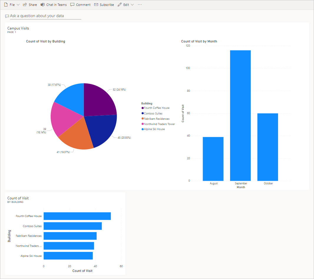
Your Campus Management dashboard should be displayed with three visuals on it. You may have to scroll down to see the new Q&A visual.
Your dashboard should look similar to the following: